Color plays such an important role when it comes to branding and/or marketing. It is just one of many ways companies and businesses use to create a lasting impression on consumers. Humans for the most part rely heavily on visual cues or visual communication. Colors aren’t just for visual communication, it also holds a cultural, societal, and symbolic significance across different countries around the world. That’s why when it comes to building a brand, colors can be one of the defining factors that can make your brand or business successful.
That’s why here are some ways how color can help your business.
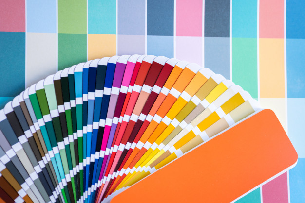
- Learn the meaning and method – Learning the meaning behind the color is one thing, but also take note of how it is applied in the real world. Learn how different companies or businesses apply color to their brand. It also helps with what is your target customer and how customers want to perceive your brand. Take, for example, BP or British Petroleum, where green is the dominant color. Petroleum companies are notorious for causing some of the most environmentally destructive disasters. Remember the deepwater horizon oil spill? Which is contradicting what the color green symbolizes. So the green color (logo) on a petroleum company is psychologically saying that they are a lover of the environment. Do customers want to perceive as a reliable and dependable brand, do they want to associate your brand with luxury or exclusivity, vibrant, approachability, and many more. So this one takes a little bit of brainstorming and research. Make sure to take some time to decide on what colors you want to incorporate.
Red is associated with danger, excitement, and energy. It’s also known for being the color of love and passion.
Pink is feminine, it’s sentimental and romantic. Different shades, like hot pink, can be youthful and bold.
Orange, like its namesake, is fresh and full of vitality. It’s also creative, adventurous, and associated with being cost-effective.
Yellow is optimistic. It’s a color associated with being playful and happy.
Green is natural, often used to demonstrate sustainability. But it can also align with prestige and wealth.
Blue is trustworthy and reliable. It’s calming or often associated with depression.
Purple is royalty and majesty. It can be spiritual and mysterious.
Brown is down-to-earth and honest, often used for organic wholesome products.
White is pure. It conveys simplicity and innocence, often with a minimalistic feel.
Black is both sophisticated and elegant. It can be formal and luxurious, but also sorrowful.
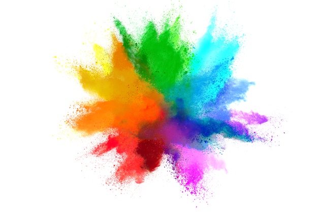
Multicolor is united or open to anything. It’s great for capturing the spirit of diversity.

- Try Mixing and Matching – can’t decide on what color to choose or color scheme for your brand? How about incorporating two or more colors. One caveat though tries to limit the colors to a maximum of three. Four or more colors, the design has to be good in order to compensate for the wide color palette. An example would be Google and eBay. Their color usage is more than three but it’s consistent when it comes to its usage and application. Yes, it’s colorful, but the minimalistic design makes it visually appealing.

- Choose the dominant and minimal – This applies whether you only have one color or two. Basically, you have to decide which colors should speak louder and which one should just be in the background. This will prove useful if you are incorporating words and typography into your logo. Choose which one will become the base. Normally this color should reflect your brand’s personality. While the minimal color on the other hand serves as an accent or something that will enhance the visual personality. An example would be the iconic McDonald’s logo. Where colors red and yellow were used. The yellow arch logo color stands out against the red which is the base color. Making the logo to be noticeable and hard to ignore.

- Learn when to turn the volume up or down – So you have decided on what colors to use to represent your brand. Just like the many shades of foundation, same color but different intensities. This means choosing a darker tone will have a different impact as compared to a lighter tint, of the same color. Let’s say, for example, the color blue. A lighter blue would evoke a feeling of approachability. But turn the volume down, let’s say to maybe a dark blue or blue-black, then it kinda becomes depressing and cold. When it comes to deciding the intensity, do you want it in a Darker shade (Color + black) which tends to be perceived as somewhat deep, dependable, reliable? While lighter tints (color + white) tend to be the more approachable, adventurous, and fun. This is so useful depending on your target audience and what kind of attention you want.

This is A Blog Written by EHP Consulting Group
Find Out More: www.ehpconsultinggroup.com
Email: [email protected]
Call: (925) 293-3313